
How to Create a Mobile Friendly Website That Gets You Leads
Is your phone quiet even though you know your website gets traffic? The problem likely isn't your service—it's that your website is useless on a smartphone. For a potential customer standing in a flooded basement or staring at a broken AC unit, your site has about three seconds to give them a way to call you. If they have to pinch, zoom, or hunt for your number, they're gone. That lead just went straight to your competitor. This guide will show you exactly how to create a mobile friendly website that turns those frantic mobile searchers into paying customers.
Why Your Website Is Failing on Mobile and Losing You Money
Let's be blunt: a website that isn't mobile-friendly is actively sabotaging your business. It's not a minor inconvenience for visitors; it's a closed door that stops qualified leads from reaching you. I see this play out constantly.
Think about it from your customer's perspective. When they search "plumber in Dallas" or "emergency roofer near me," it’s almost always happening on their phone. They need help now.

If they land on your site and can't find your phone number in one second, they're gone.
The Real Cost of a Clunky Mobile Site
Here’s how you lose jobs every single day with a bad mobile site:
- The HVAC Emergency: A homeowner’s AC dies during a Phoenix heatwave. They search "AC repair Phoenix" and tap your site. It takes five seconds to load, and the text is microscopic. They hit the back button and call the next company on Google. You lost a $500 repair job.
- The Real Estate Inquiry: A couple drives through a neighborhood they love and sees your "For Sale" sign. They pull up your real estate agency's site to see the price and photos. It’s a jumbled mess. They give up and open Zillow instead. You lost a potential commission.
This isn't just about looking good. Mobile devices account for over half of all web traffic. More importantly, Google's mobile-first indexing means it ranks your site based on the mobile version. A bad mobile site will sink your local search rankings, making you invisible for those critical 'near me' searches.
Adopting a Mobile-First Strategy
"Mobile-first" isn't a tech trend; it’s a business strategy. It means you design your website for the phone first, then adapt it for a desktop.
This forces you to put the most critical information—your phone number, services, and a "Get a Quote" button—front and center for the majority of your prospects. You can learn more about the technical side in our guide to responsive web design techniques.
This isn't theory. This is how you stop losing leads to your competitors.
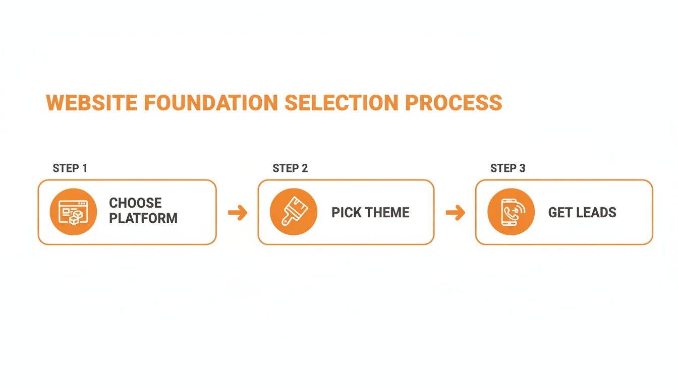
Step 1: Choose the Right Foundation for Lead Generation
Forget the technical jargon. For a roofer or a dentist, choosing a website platform is a business decision. The only question that matters is: which option will bring more customers through my door?
Your choice here is the bedrock of your online strategy. Get it right, and your site becomes a 24/7 lead machine. Get it wrong, and you'll fight a system that's working against you, missing out on customers who can’t find or use your site.
Hosted Builders vs. WordPress: The Real-World Breakdown
You have two main paths: all-in-one builders or a self-hosted platform like WordPress.
Hosted builders like Squarespace and Wix are tempting. They promise drag-and-drop simplicity for one monthly fee. It sounds perfect for a busy contractor.
But that convenience comes at a huge cost: control. You’re building your business on rented land. If you ever want to leave, you can't take your website with you—you start over from scratch. Worse, their SEO capabilities are basic, making it nearly impossible to compete for valuable local search terms like "landscaping in St. Petersburg."
This is why we build exclusively on WordPress. Not because it's fancy, but because it's the most powerful foundation for a local business that wants to stand out in its market. You own your website, have total control over your SEO, and can integrate any lead-capture tool imaginable.
See what goes into a site built for performance in our guide on small business website design.
Platform Comparison for Local Service Businesses
| Platform | Best For | Mobile-Friendliness | Local SEO Control | Spark Hive Verdict |
|---|---|---|---|---|
| WordPress | Growth-focused businesses needing full control. | Excellent (Theme-dependent) | Complete Control. Unmatched for local SEO. | The only choice for a serious service business aiming for long-term growth. |
| Squarespace | Creatives and simple portfolio sites. | Very Good (Templates are responsive) | Basic. Lacks the power to compete in tough markets. | A good starting point, but you'll outgrow it and face a costly migration. |
| Wix | DIY beginners who prioritize ease over performance. | Good (Editor can be tricky) | Limited. Falls short of WordPress's power for serious SEO. | The "training wheels" of website builders. Not for businesses serious about leads. |
Owning your platform with WordPress is the only path that gives you the freedom and power to actually grow.
What Is a Responsive Theme and Why It Matters
Once you choose WordPress, you need a theme. A theme is the blueprint for your site's layout and design.
A responsive theme automatically adapts its layout to fit any screen, from a desktop monitor to a smartphone. This is non-negotiable.
Since mobile phones drive the majority of website traffic—a staggering 62.66% worldwide according to mobile traffic statistics on DesignRush—a non-responsive site is like putting a "Closed" sign on your digital door.
For a local business, this is even more critical. A patient searching for a "Tampa dentist near me" on their phone needs to find your info instantly. A responsive theme ensures they have a smooth experience, find what they need, and become a lead instead of a frustrated visitor.
Step 2: Design for Mobile Action, Not Desktop Browsing
A mobile-friendly website isn't your desktop site squished onto a small screen. It’s a tool built for someone scrolling with their thumb, in a rush, looking for an answer to a problem right now.
Your mobile site has one job: turn a visitor into a paying customer as fast as possible. This isn't about winning design awards; it's about pure function that drives revenue.
Must-Haves for a High-Converting Mobile Layout
Put yourself in your customer’s shoes. A pipe just burst. They need help. Your mobile design must cater to that urgency.
- "Fat-Finger Friendly" Buttons: Every clickable element—especially your phone number and quote forms—needs to be big, bold, and easy to tap. If someone has to zoom in to tap a link, you've already lost.
- Instantly Visible Contact Info: Your phone number must be one of the first things a visitor sees, no scrolling needed. And it absolutely must be a clickable link. Implement a click to call feature so it dials your number instantly.
- Simple, Obvious Navigation: Ditch the fancy dropdown menus. A mobile "hamburger" menu should stick to the essentials: Home, Services, About, and Contact. Anything else is just clutter.
Getting from your homepage to calling you should take two taps, max.
Real-World Examples for Service Businesses
Let's get practical. How does this look for a contractor or a dentist?
- For a Roofer in Miami: Your mobile site needs a big, bold button that says "Emergency Leak Repair," and it should be "sticky," staying at the top of the screen as someone scrolls. After a storm, homeowners aren't shopping; they're looking for the fastest fix.
- For a Dentist in Chicago: The main call-to-action has to be a "Book an Appointment" button leading to a simple form: name, phone, and preferred time. Don't make them fill out their medical history on a tiny screen.
- For an HVAC Contractor in Austin: When it's 100 degrees, the most valuable part of your mobile site is a banner that says, "Broken AC? Call Now for Same-Day Service." Make that phone number impossible to miss.
The goal of your mobile design is not to tell your company's life story. It is to solve the visitor's immediate problem by making it incredibly easy for them to hire you.
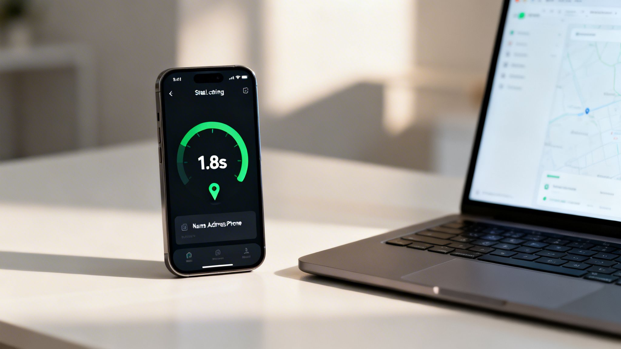
Step 3: Get Fast and Get Found with Speed & Local SEO
A slow website is a dead website on mobile. If your site takes more than three seconds to load, over half your potential customers are gone. That's a lost job handed to a competitor.
Building a great mobile site boils down to two things: lightning-fast page speed and sharp local SEO. A fast site gets a ranking boost from Google, and strong local SEO makes sure you appear in searches that matter, like "HVAC repair in Phoenix."
Quick Wins for a Faster Website
Page speed isn't a technical metric; it’s a customer experience metric. Slow sites feel broken and untrustworthy.
- Shrink Your Images. This is the #1 cause of slow sites. Before uploading photos, run them through a tool like TinyPNG. It shrinks file sizes by up to 70% without losing quality.
- Pick a Lightweight Theme. Bloated themes slow you down. Look for themes marketed as “lightweight” or “performance-focused.” Speed beats gimmicks every time.
- Use a Caching Plugin. A caching plugin (like WP Rocket or W3 Total Cache) creates a saved "snapshot" of your site, dramatically cutting load times.
- Test and Act. Use a free tool like Google’s PageSpeed Insights. It gives you a score and a specific to-do list to improve performance.
A fast mobile website isn't a luxury; it's the cost of entry. If you fail on speed, you fail to get the lead.
Your Mobile SEO Checklist
Once your site is fast, you need to show up when local customers search. This is how you prove to Google that you are a legitimate, active business serving a specific area.
- Master Your Google Business Profile. Your Google Business Profile is often the first impression a mobile user has of you. Fill out every section. Our guide on how to optimize your Google Business Profile is a great starting point.
- Lock Down Your NAP Consistency. Your Name, Address, and Phone number (NAP) must be identical everywhere online—your website, GBP, Yelp, Angi, etc. "St." vs. "Street" can confuse search engines and hurt your rank.
- Create Hyper-Local Service Pages. Don't just list the towns you serve. Create dedicated pages like "Remodeling in St. Petersburg" and "Kitchen Renovations in Clearwater." This shows Google your relevance for those specific local searches.
Combining a fast site with smart local SEO is how you stop competing on price and start winning on visibility and trust. It's also a key part of learning how to promote your local business effectively. After implementing these changes, run through a complete website launch checklist to ensure everything is perfect.
Frequently Asked Questions (FAQ)
What's the most important thing for a service business mobile site?
One-tap contact. Your phone number must be a clickable button at the very top of the screen. A customer with an emergency (leaky pipe, broken AC) needs to call you instantly, not hunt for a phone number. Everything else is secondary.
How much does it cost to make a website mobile-friendly?
If you're on WordPress, switching to a modern, responsive theme might cost you $60-$100. If your site is old or on a platform like Wix, you're better off with a professional redesign. Think of it as an investment, not a cost. A site that brings in just one extra job a month will pay for itself.
Can't I just use a plugin to make my site mobile-friendly?
No. Those "one-click mobile" plugins are terrible. They create a slow, generic, and ugly version of your site that looks unprofessional. This hurts customer trust, which is critical for a local service business. A true, responsive design is the only way to go.
How do I test if my website is mobile-friendly?
First, use Google's own Mobile-Friendly Test tool for a technical pass/fail. Second, do the real-world test: pull up your site on your own phone. Can you read everything? Can you tap the phone number to call? If it's frustrating for you, it's a disaster for a potential customer.
Should my mobile site look different from my desktop site?
Yes, absolutely. A good responsive design doesn't just shrink things down; it reorganizes them. The mobile version should hide unnecessary clutter and prioritize the absolute essentials: your phone number, a "get a quote" button, and your core services.
Stop Losing Leads to Your Competitors
You now know exactly what a mobile-friendly website needs to do: capture leads. But knowing and doing are two different things. Your website should be your hardest-working employee, bringing in qualified leads 24/7.
A killer website is a huge piece of the puzzle, but it’s part of a bigger strategy for lead generation for small businesses.
Ready to stop guessing and build a website that actually makes your phone ring? Book a free, no-fluff strategy call with our team at Spark Hive. We'll show you exactly what's holding your current site back and create a clear plan for getting more local jobs.
Book Your Free Strategy Call Now
Related resources for Tampa Bay business owners


You May Also Like

Website Best Practices Checklist: 9 Web Design Best Practices

Website Design: Ultimate Guide to Stunning Sites